education, examples, overfitting, regression, visualization
A visit from the Tilburg University
AJDA
Oct 02, 2015
Biolab is currently hosting two amazing data scientists from the Tilburg University - dr. Marie Nilsen and dr. Eric Postma, who are preparing a 20-lecture MOOC on data science for non-technical audience. A part of the course will use Orange. The majority of their students is coming from humanities, law, economy and behavioral studies, thus we are discussing options and opportunities for adapting Orange for social scientists. Another great thing is that the course is designed for beginner level data miners, showcasing that anybody can mine the data and learn from it. And then consult with statisticians and data mining expert (of course!).
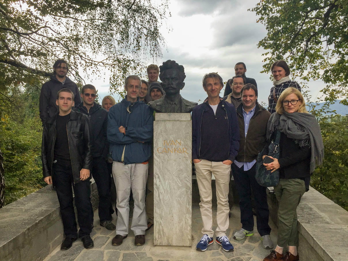
Biolab team with Marie and Eric, who is standing next to Ivan Cankar - the very serious guy in the middle.
To honor this occasion we invite you to check out the Polynomial regression widget, which is specially intended for educational use. There, you can showcase the problem of overfitting through visualization.
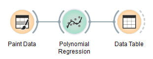
First, we set up a workflow.
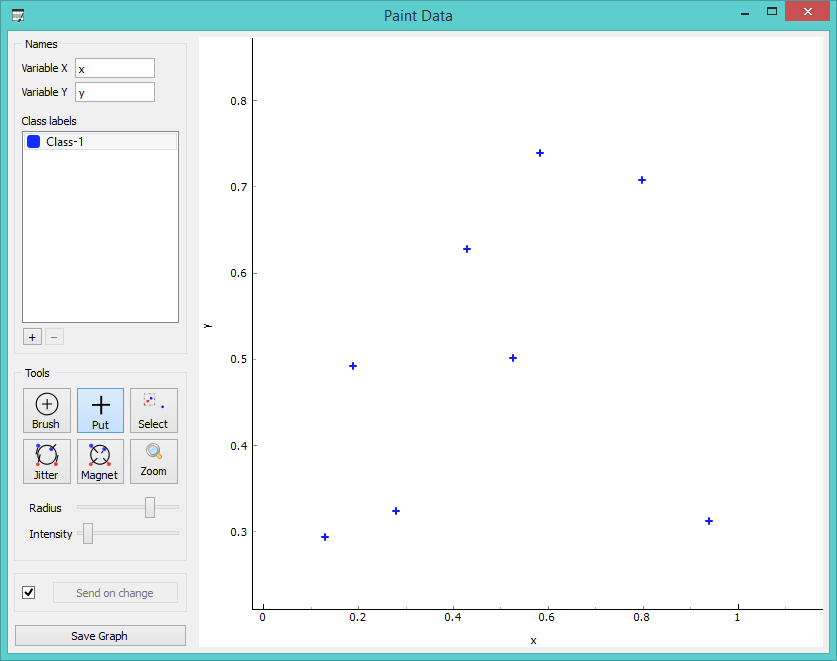
Then we paint, say, at most 10 points into the Paint Data widget. (Why at most ten? You’ll see later.)
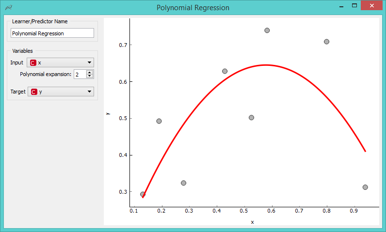
Now we open our Polynomial Regression widget, where we play with polynomial degree. Polynomial Degree 1 gives us a line. With coefficient 2 we get a curve that fits only one point. However, with the coefficient 7 we fit all the points with one curve. Yay!
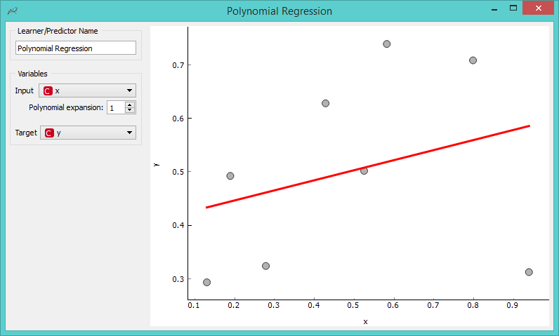
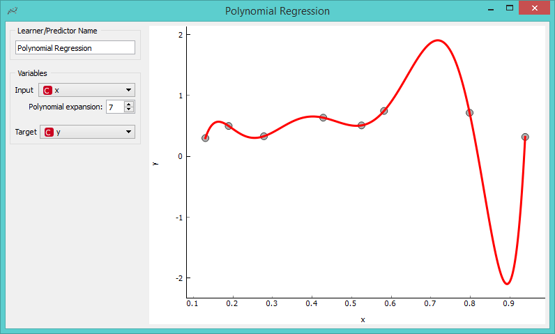
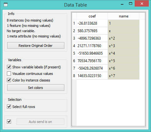
But hold on! The curve now becomes very steep. Would the lower end of the curve at about (0.9, -2.2) still be a realistic estimate of our data set? Probably not. Even when we look at the Data Table with coefficient values, they seem to skyrocket.
This is a typical danger of overfitting, which is often hard to explain, but with the help of these three widgets becomes as clear as day! Now go out and share the knowledge!!!