addons, analysis, images, interactive data visualization, orange3, visualization
Outliers in Traffic Signs
BLAZ
Apr 25, 2017
Say I am given a collection of images of traffic signs, and would like to find which signs stick out. That is, which traffic signs look substantially different from the others. I would assume that the traffic signs are not equally important and that some were designed to be noted before the others.
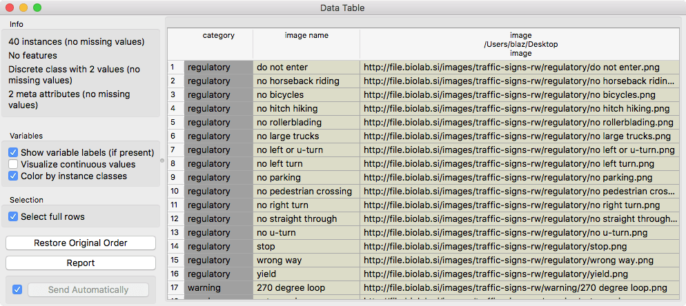
I have assembled a small set of regulatory and warning traffic signs and stored the references to their images in a traffic-signs-w.tab data set.
Related: Viewing images
Related: Video on image clustering
Related: Video on image classification
The easiest way to display the images is by loading this data file with File widget and then passing the data to the Image Viewer,
Opening the Image Viewer allows me to see the images:
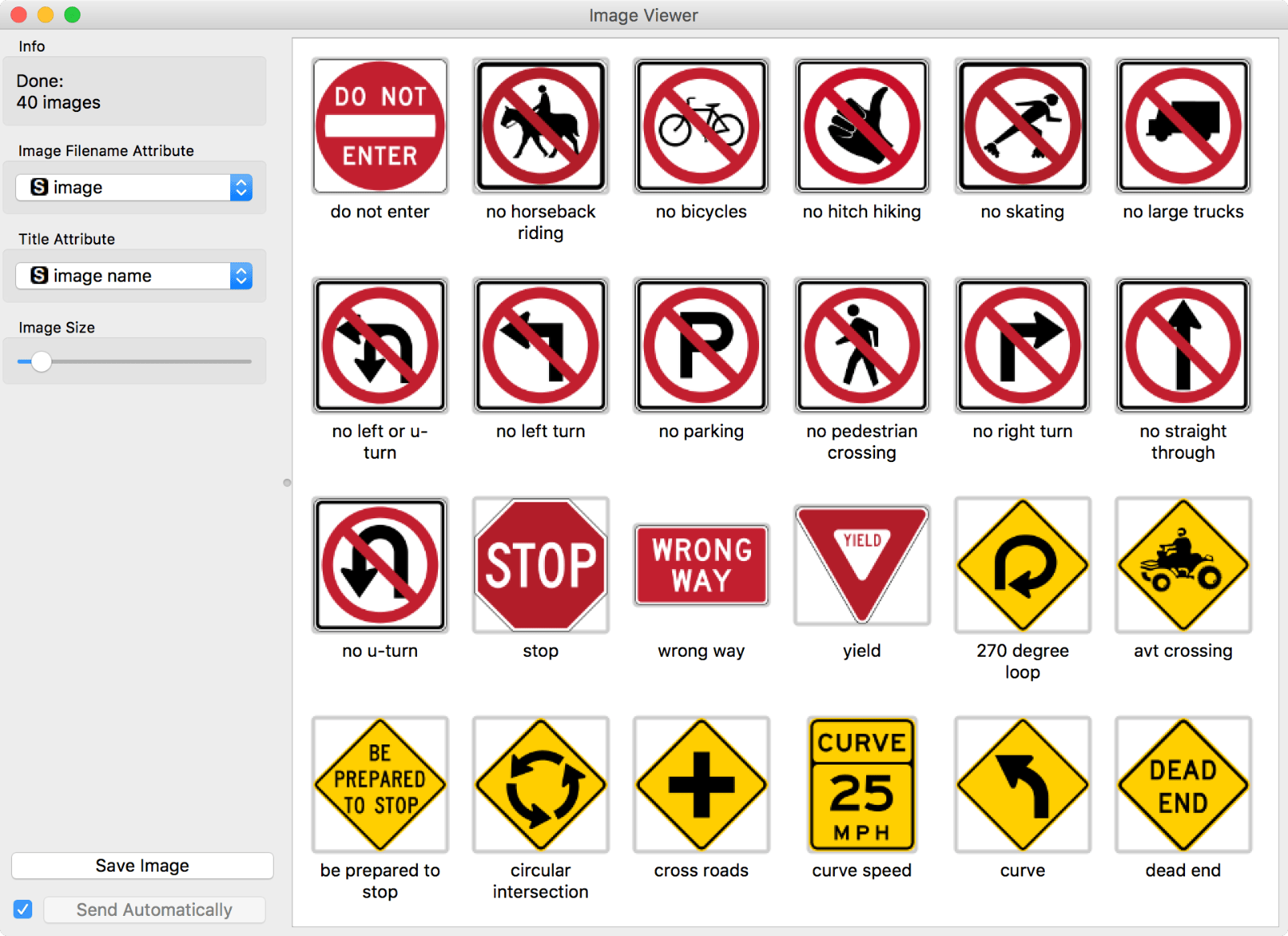
Note that initially the data table we have loaded contains no valuable features on which we can do any machine learning. It includes just a category of traffic sign, its name, and the link to its image.
We will use deep-network embedding to turn these images into numbers to describe them with 2048 real-valued features. Then, we will use Silhouette Plot to find which traffic signs are outliers in their own group. We would like to select these and visualize them in the Image Viewer.
Related: All I see is silhouette
Our final workflow, with selection of three biggest outliers (we used shift-click to select its corresponding silhouettes in the Silhouette Plot), is:
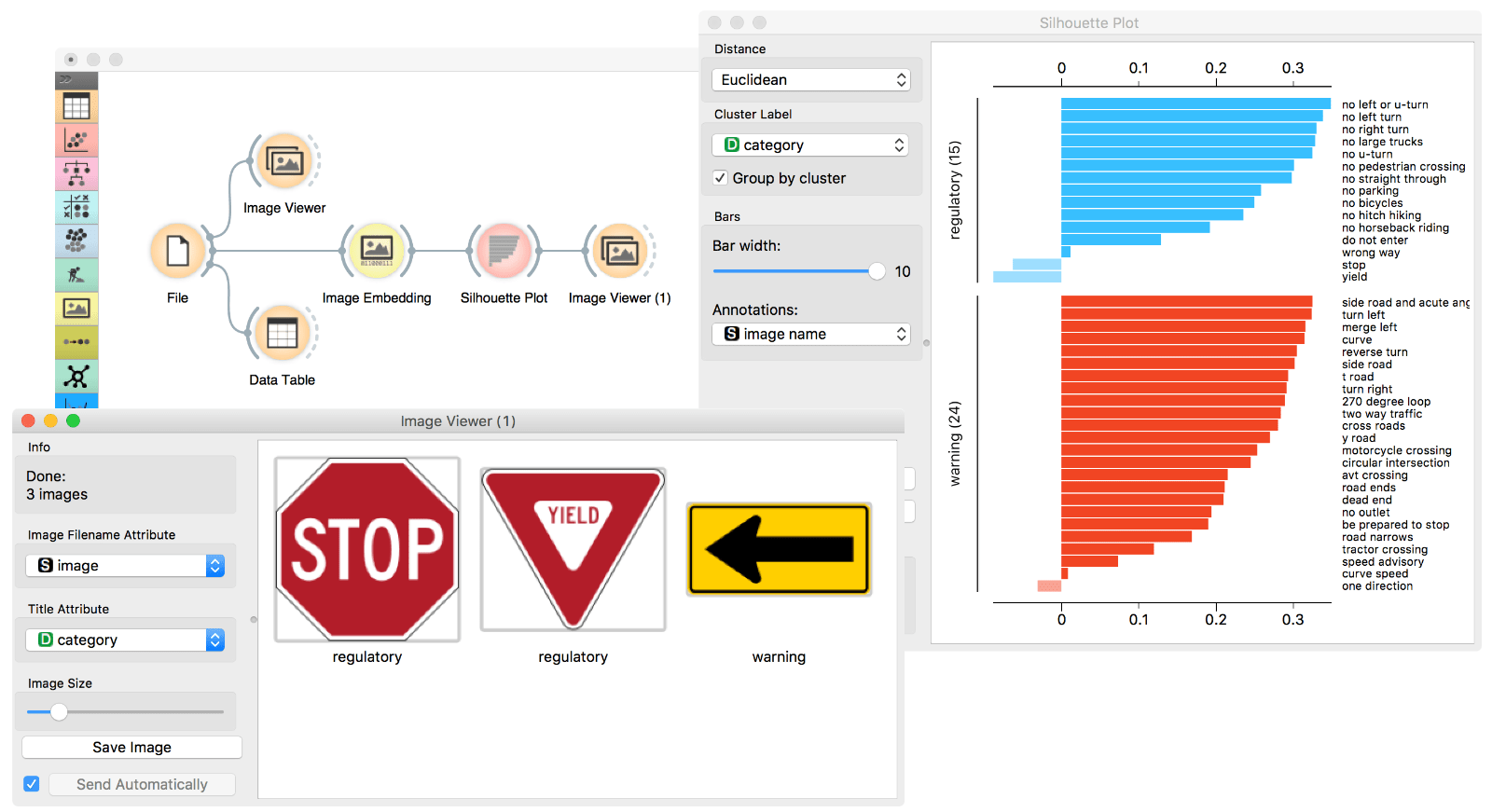
Isn't this great? Turns out that traffic signs were carefully designed, such that the three outliers are indeed the signs we should never miss. It is great that we can now reconfirm this design choice by deep learning-based embedding and by using some straightforward machine learning tricks such as Silhouette Plot.