covid-19, visualization, addons, trends, time
Data Mining COVID-19 Epidemics: Part 3
Andreja Kovačič
Apr 20, 2020
So far, we've seen how to make basic visualizations related to the corona virus and how to look at the disease progression on the map. Be sure to check them out first, before delving into this one.
We are now heading towards somewhat more advanced visualizations that let us observe trends in the data. Just as a heads up: your results may be different, depending on the day you downloaded the data. We are working with confirmed cases up to April 13, on the previously mentioned data from the John Hopkins University.
Prerequisite: Timeseries add-on
The spread of the virus is influenced by many factors, time being one of them. Timeseries add-on specializes in manipulation of time-related data. If you followed our blogs, you should already have it installed. If you don't, just take a peek in the second one.
Formatting the data As Timeseries
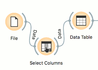
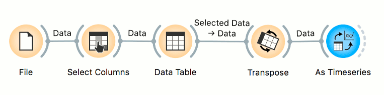
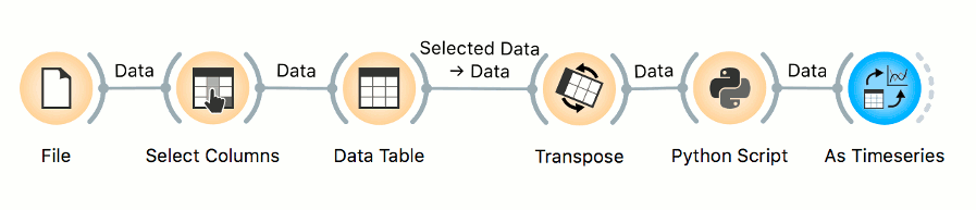
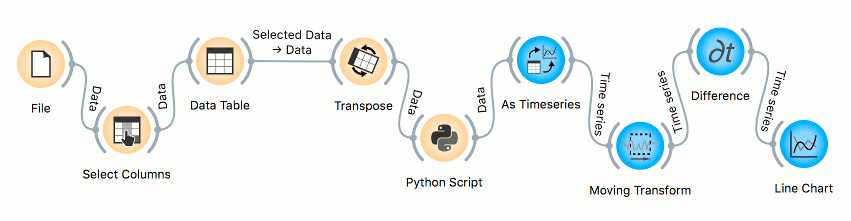
We'll load our data as usual with the File widget. The data contains latitude and longitude columns, which are just getting in the way in our further analysis. We will use Select Columns to put them into meta columns and thus exclude them from any calculations. Then we'll select some countries we are interested in with the help of the Data Table. You could also do it straight after inspecting the data in Geo Map.
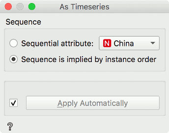
Now we just need to tell Orange, which variable contains time stamps. Our dates are represented as columns instead of as rows, so we'll use Transpose widget to make each row represent a datum and then connect it to As Timeseries Widget. In Transpose, we set the variable whose values will be used to name the rows when they are turned into columns. We'll name them by the column Country, as shown in the image, since the Province field is mostly empty. In As Timeseries, we set sequence as implied by instance order.
Here is our chain of widgets. We should now be ready to start making some plots. Phew.
Line Chart and log plot
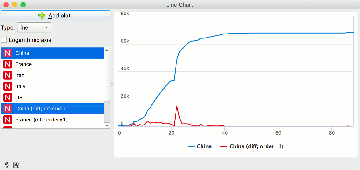
Make sure you've selected countries you are interested in the Data Table. I've chosen Italy, US, Iran, France and Chinese province Hubei. Then, connect As Timeseries widget and Line Chart and let's get plotting. Once in Line Chart, we can select multiple countries by clicking Ctrl/Cmd and draw them on the same axis or we could compare multiple plots by clicking on Add plot.
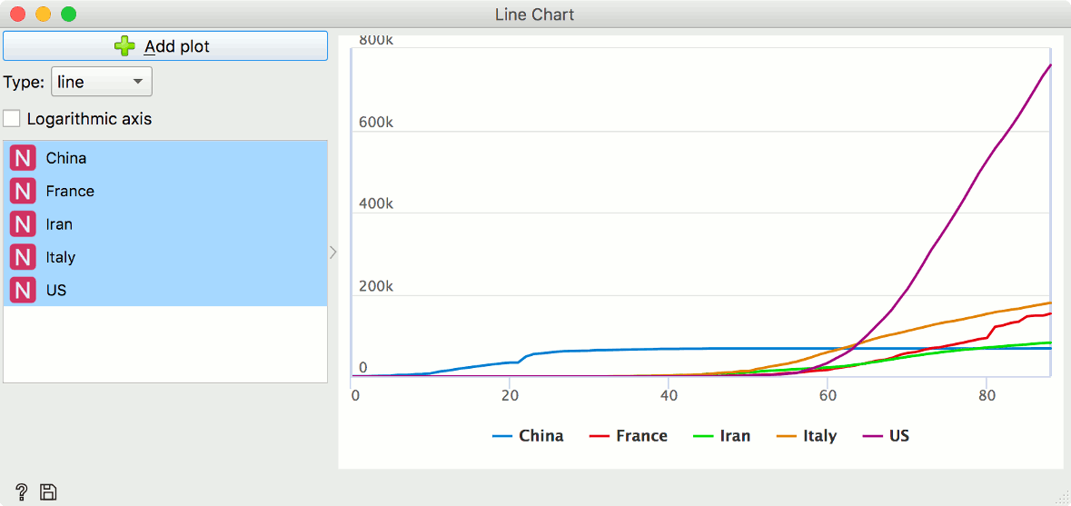
Here, we see how the virus started its path in China, where the number of cases quickly rose but has since then stayed level. Other countries were hit later on. The slopes of the curves tell us how fast the numbers are growing, but more on that later. One thing to notice though: due to the fast growth of the virus in some countries, some smaller slopes are almost invisible. We can remedy that by checking the Logarithmic axis box just like this:
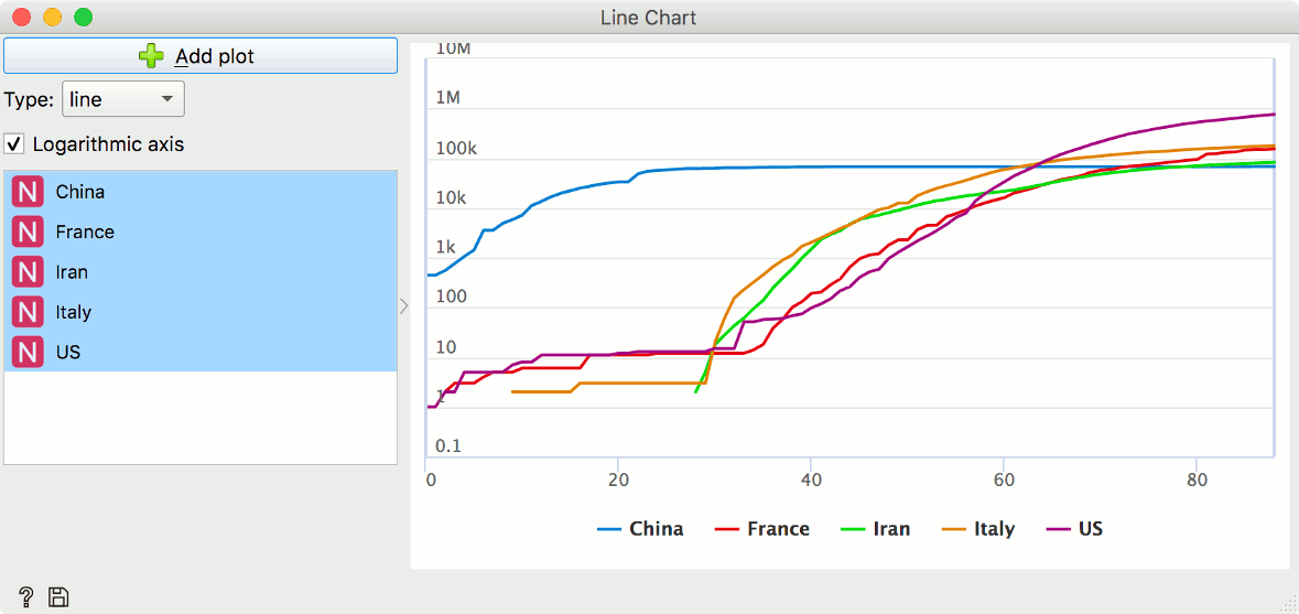
We can now see the first steps as well as the current situation.
Python Script
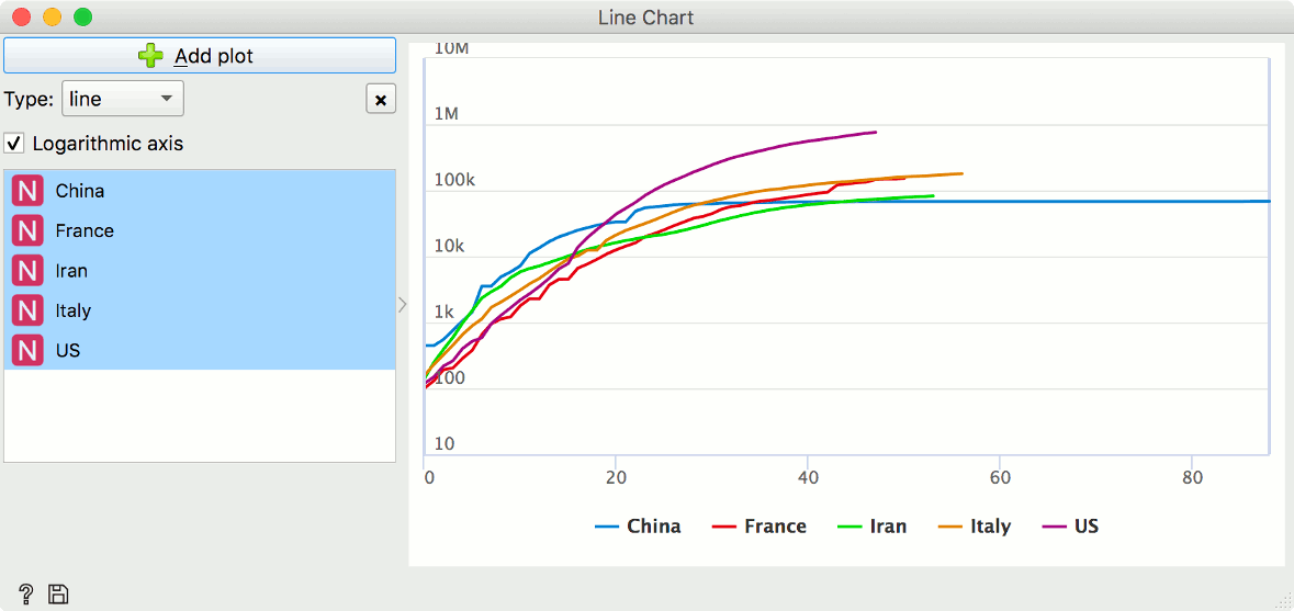
We can see from these plots, that different countries came into contact with the virus at different times. It seems it would be much easier to compare the curves if all of them started their climb at the same time. We can do that with just a few lines of code. Example snippet here aligns the curves with the moment where the country recorded 100 cases. You can set n to any other (positive) number if you will, though.
import numpy as np
from copy import deepcopy

n = 100
out_data = deepcopy(in_data)
out_data.X[out_data.X < n] = 0
ar = np.argwhere(out_data.X)

cols, shifts = np.unique(ar[:, 1], return_counts=True)
out_data.X = np.array([np.roll(out_data.X[:, col], shift) for col, shift in zip(cols, shifts)]).T
out_data.X[out_data.X==0]= np.nan
Copy these lines into Python Script widget, and plug it into our initial snake of widgets like so:
Look at the aligned curves now, they are much easier to compare.
Absolute growth with derivative
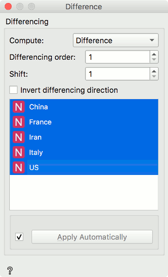
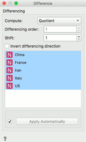
Let's take a look at how fast the confirmed cases are spreading. Connect As Timeseries with Difference widget, choose Differencing and select countries of interest. Differencing order of 1 means we'll be looking at derivative of first order, which just means daily change in our case. We'll leave shift as is, on 1.
Again, we'll view the transformed curves in Line Chart. Notice how the difference (and every other) transform adds a new column? That means we can compare our curves in different states, so be sure to always check what is being shown. For starters, try looking at, for example, China and its transformed version. See how easy it is to spot the daily spikes that are perhaps out of the ordinary and need to be checked? The most prominent spike here is probably due to the change in counting.
If we again compare multiple countries, we notice the US's speedy climb and Iran seemingly being more successful in curbing the growth.
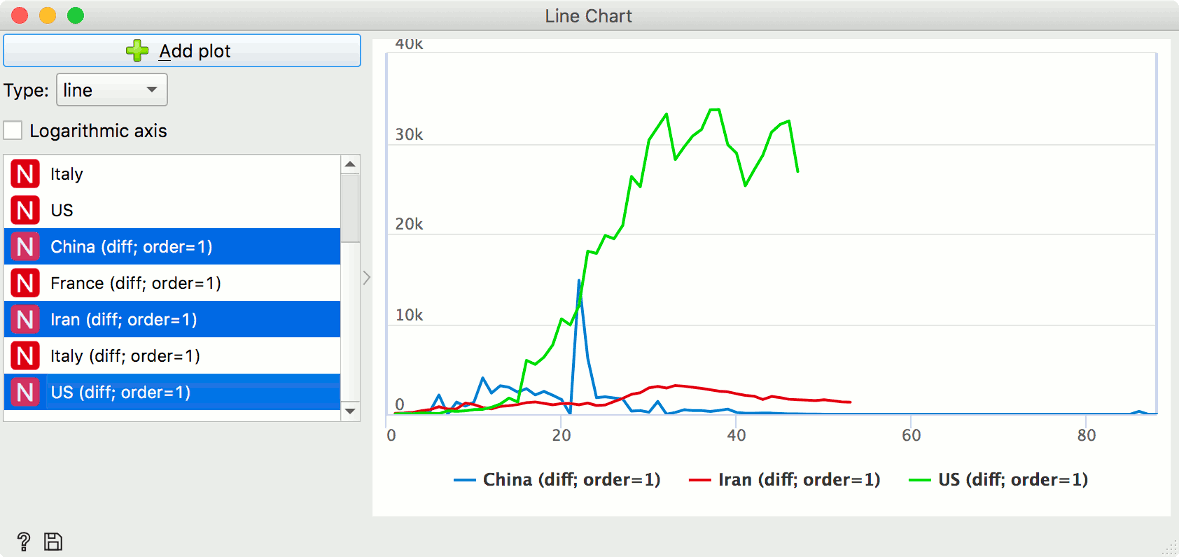
The difference could be only due to the difference in population and what is an overwhelmingly large number of patients for one country might be almost business as usual for another one.
Scale free growth with quotient
Difference widget also has the option to output the quotients. It will allow us to observe the relative growth and compare countries directly.
Let's look at, for example, China (Hubei province) vs France.
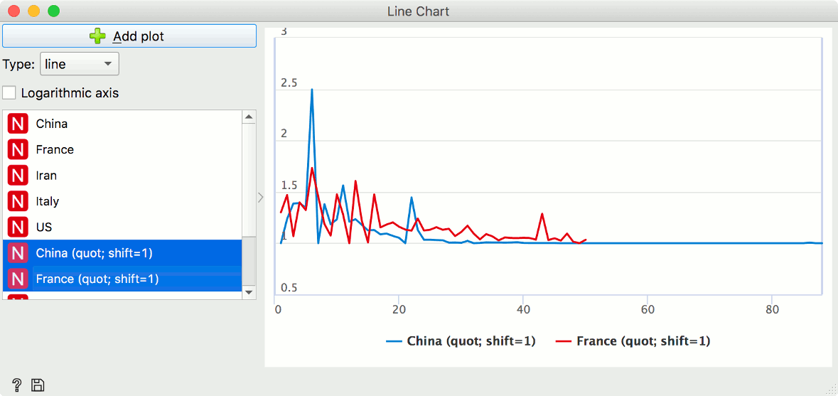
It seems China is doing worse in the beginning and better later on, but it is impossible to tell at which point the trends start to shift. There are just too many jumps, due to noise in testing and reporting. So for our final step, let's smooth things out.
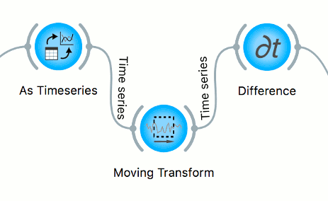
Moving transform and smoothing
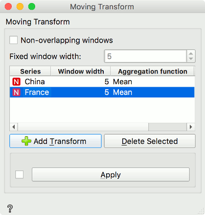
Smoothing is usually a part of preprocessing, so insert the Moving Transform widget between As Timeseries and Difference, and add some moving average transforms, like this:
Selecting now smoothened China and the France data in Difference widget, yields the following plot in Line Chart:
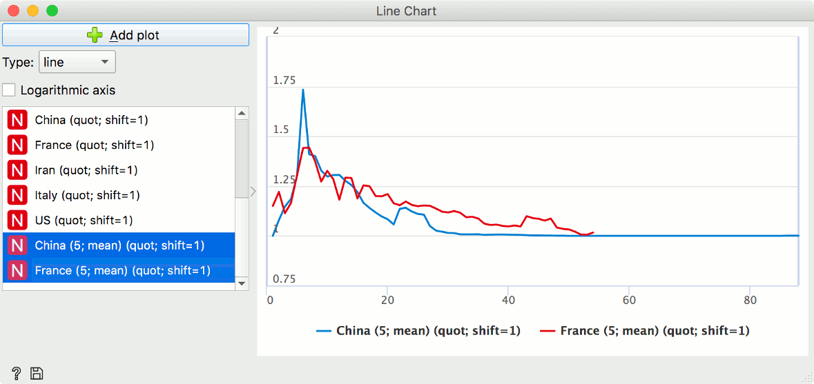
The trends now seem clearer. The countries have somewhat similar trends up to 15th day, when China's growth falls decisively below the French.
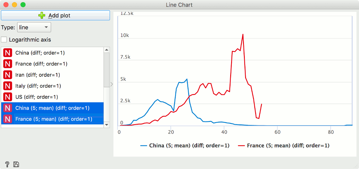
Quotient plot obviously benefited from smoothing, as did the difference plot. For completeness, we added another Difference widget after Moving Transform, and plotted now smoothed difference between the two countries. Notice how the turning point is now seemingly further down the line. Orange prides itself on interactivity, so just by sliding the mouse over the plot, we get the exact information regarding the days and counts. The turning point seems to be on the 25th day.
This blog concludes our Corona virus series for now. Until our next blog, stay safe.
Orange is a multi-platform open-source machine learning and data visualization tool for beginners and experts alike. Download Orange, and load and explore your own data sets!
In addition to a variety of learning materials posted online in the form of blog posts, tutorial videos, we've created a Discord server. Join the community, tell us what you think!