dask, survival analysis
From Data Portals to Portals of Doom: Avoiding it with Dask
Jaka Kokošar
Nov 08, 2023
Since its inception, The Cancer Genome Atlas (TCGA) project has been a treasure trove of data for biomedical researchers. The data TCGA provides is essential for researchers who want to analyze potential biomarkers. But there's a hitch. Not every researcher is a data whisperer.
Luckily, there are several web-based tools that researchers can add to their toolkits. These tools make it easy to access and analyze survival data from TCGA. Notable examples are Kaplan-Meier Plotter and GEPIA, among others.
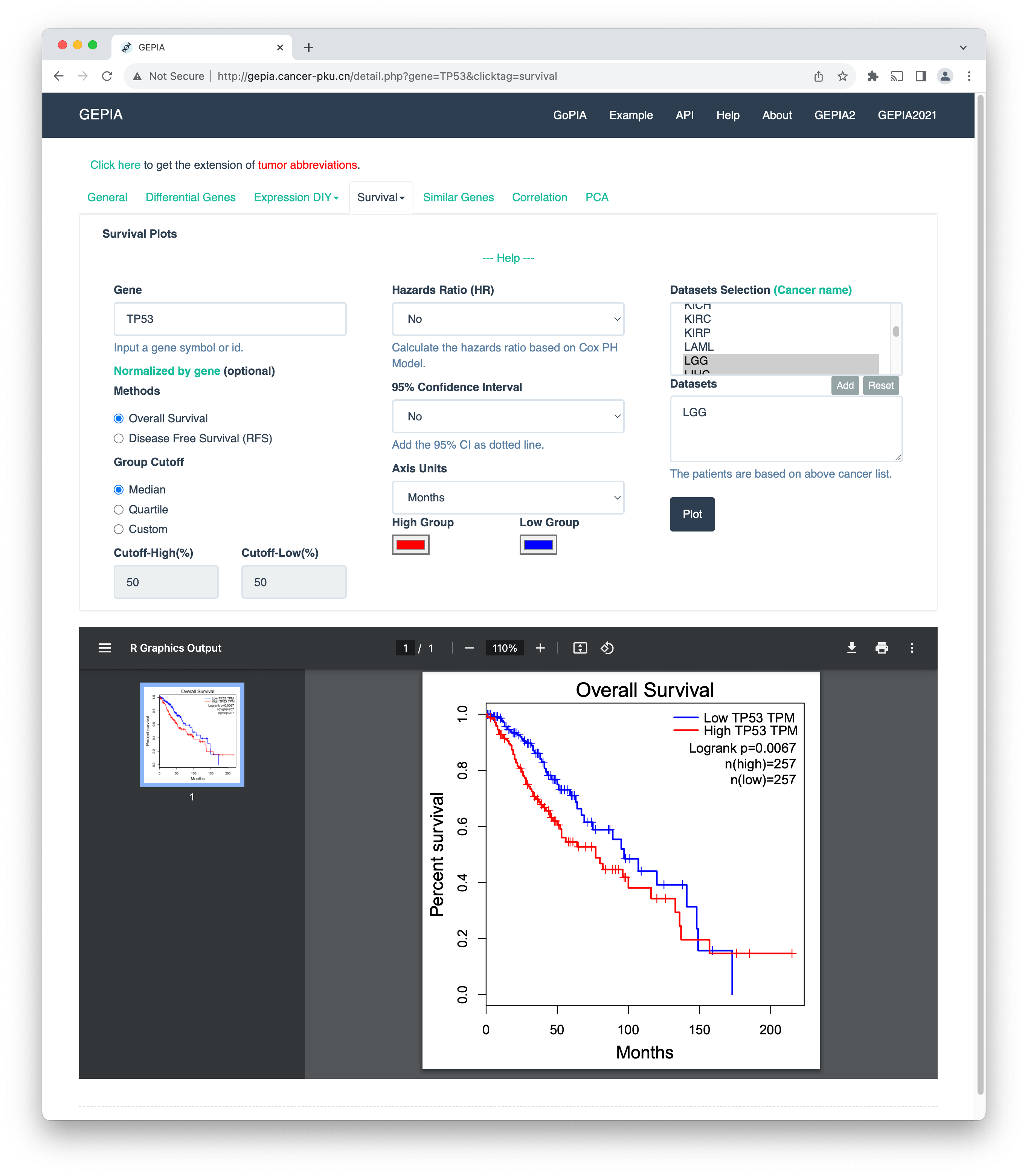
In their very essence, these tools allow you to enter a gene name and output the results of the analysis on pre-curated TCGA datasets. For example, in the image above, I have entered the gene name TP53 and selected the cancer type "lower-grade glioma" (TCGA-LGG). We see the Kaplan-Meier plot for the high- and low-risk patient groups and corresponding p-values, which quantify the difference in survival between the groups. For details, refer to a review paper by Zheng and others.
Looks good; where is the catch? Well, we shouldn't blindly trust the underlying source of survival data of those web-based tools. Curated datasets between tools can vary; more in Idogawa et al.. And this is no small thing. Adding fuel to the fire here, I will let the reader guess how many of those tools are open-source.
Still, despite their limitations, these tools are useful. However, I would like to analyze data from sources I trust. Therefore, I have prepared notebooks that can download gene expression and survival data for all cancer types in the TCGA project. I see the irony here: I am not asking you to trust my code; if you can, verify it. Or, download from the official GDC data portal.
The combined dataset from TCGA consists of approximately 10K samples and 60K gene expression values. The size of the file on my disk is around 3GB. You might think this is not much, but try loading it in Pandas. You will need around 30GB of system memory and 17 minutes just to read the file.
import pandas as pd

df = pd.read_csv('data/TCGA-combined.csv')

# peak memory: 30722.37 MiB, increment: 30597.50 MiB
Instead of coding, could we use any existing visual analytics tools? Kaplan-Meier plotter stands out because it allows me to upload my own data (a rare find among all the other tools). That is just what I was looking for!
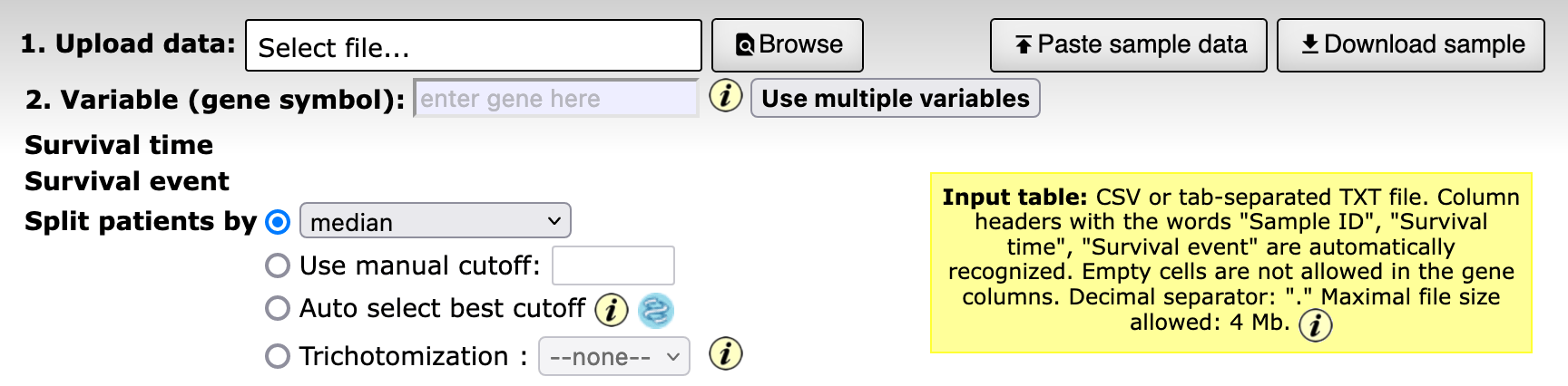
The option to upload my own data is cool, but there is a 4MB limitation. What about Orange?
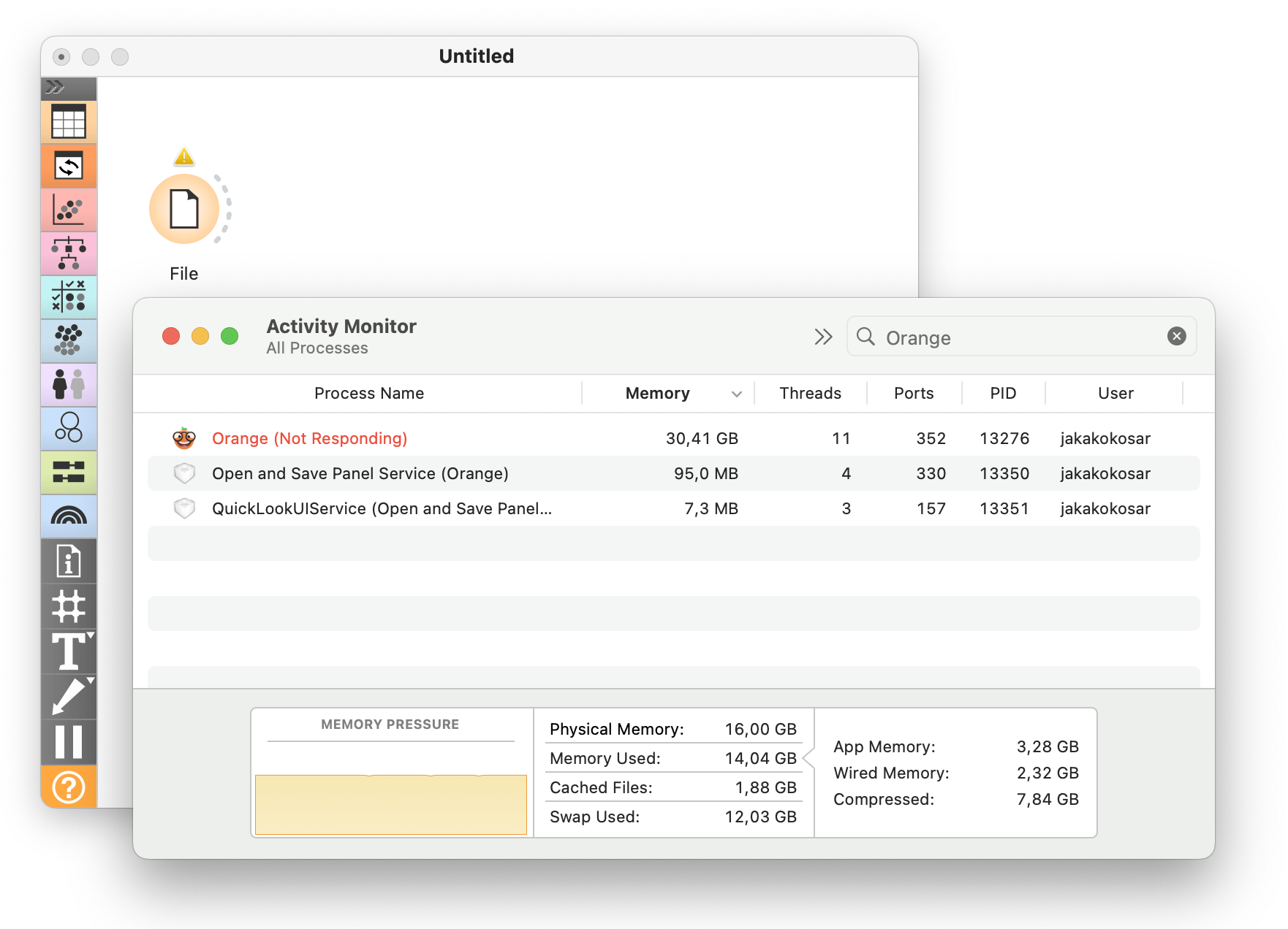
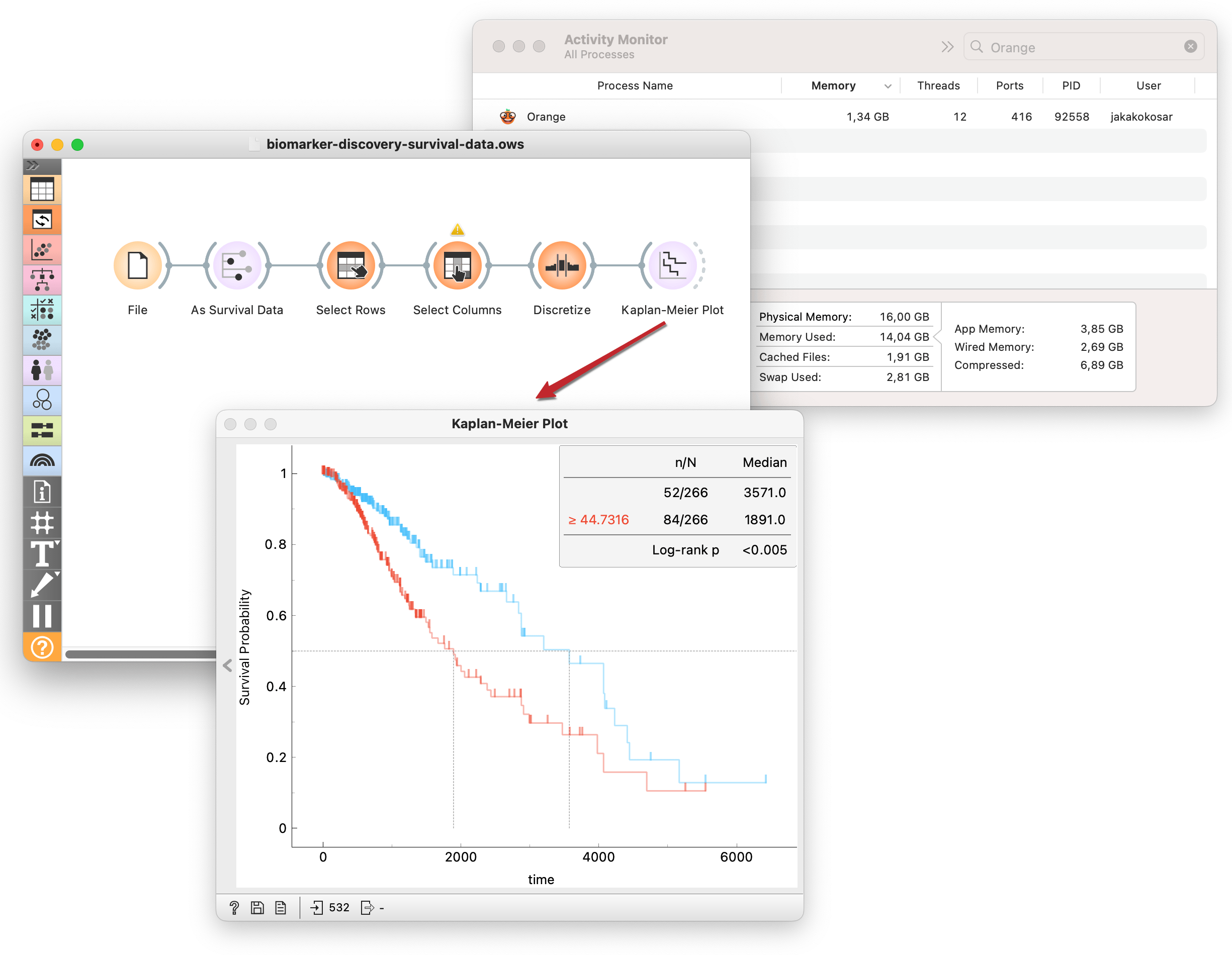
Well, things quickly get out of hand. Orange typically handles files that are within the range of a few hundred megabytes just fine. This, of course, also depends on the specifications of the machine that Orange is running on. To support much larger files, we extended Orange with on-disk data support, where the complete data is never loaded into memory. We used Dask as the backend for the experimental Orange version. For more, refer to the previous blog post.
Now that I can work with large datasets in Orange, I have a similar tool to those web-server-like ones: the difference is that I have to bring my own data and construct my analysis pipelines from scratch. But this is also advantageous: I am not limited to task-specific analyses that those other tools provide, and I can fully trust the data source.
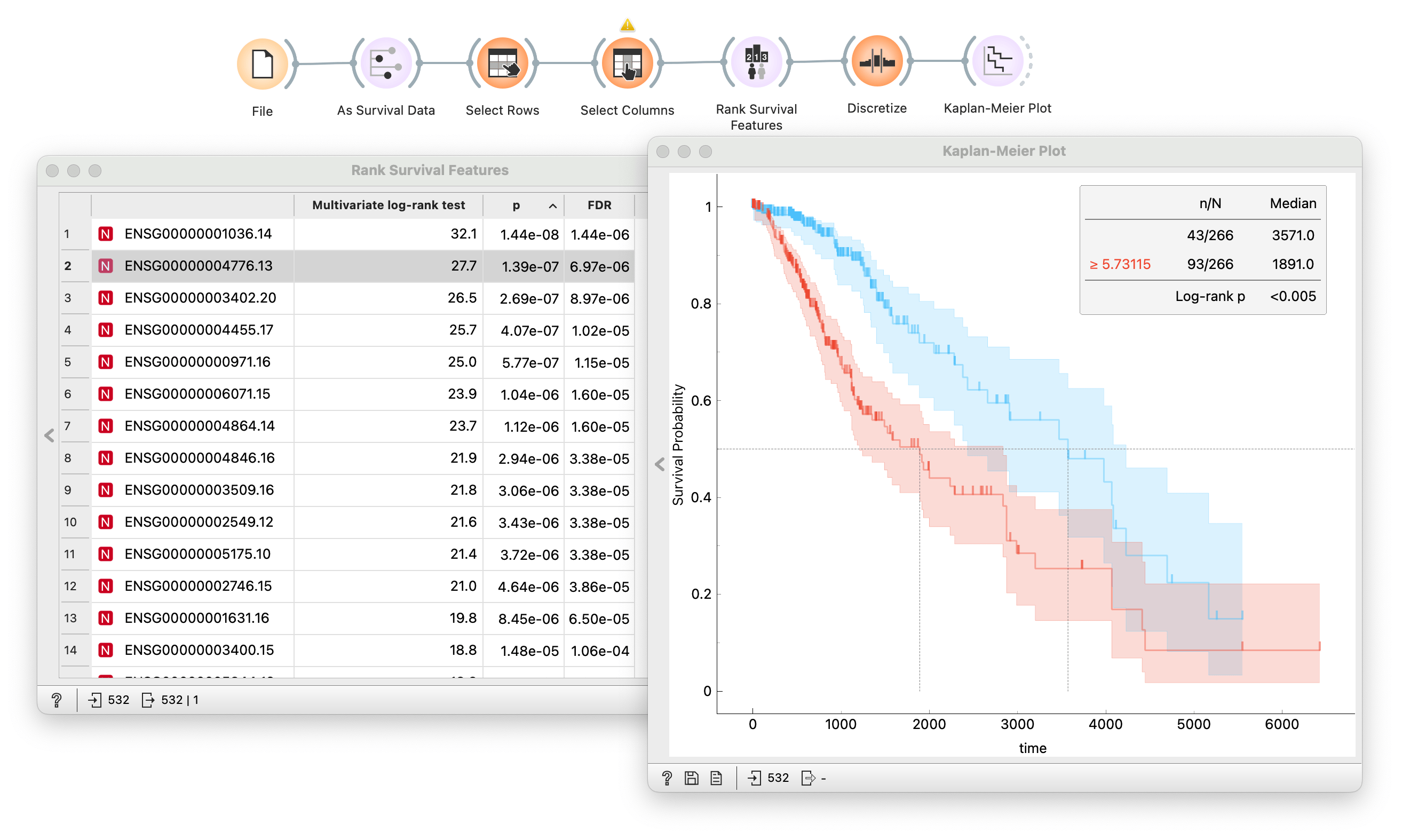
Here, I stratify lower-grade glioma patients (TCGA-LGG) into high- and low-risk groups according to the expression of gene TP53. Then, I use the Kaplan-Meier widget to compute and plot survival curves and test how significant the difference in survival between the groups is using the log-rank test. All this without my computer breaking a sweat!
With the workflow I constructed above, I could click through a list of genes and observe the results. But in my data, I have a lot of genes. Clicking so many becomes a tedious task. I could automate this process with the Rank Survival Features widget. The output is the ranked list of genes based on the p-value from the log-rank test.
And since we have the whole TCGA datasets loaded, I could branch the same workflow and repeat the same procedure on different types of cancer and compare results side by side!
A stable Orange release will suffice for smaller data sets. For more options, check the library of survival analysis workflows. You will find workflows that range from simple survival curve estimation to more complex analysis using Cox regression are readily available to experiment with.
Thats it! You can download and try the full workflow. Remember: for big data sets, use the experimental Orange version.