explain, prototypes, scoring sheet
Scoring Sheets: Transform Data into Insightful Scores
Žan Mervič
Jan 11, 2024
Machine learning models are becoming increasingly powerful and complex tools. This can be very useful in areas such as finance, where accuracy is paramount. However, model complexity can be a double-edged sword, especially when trying to explain the reasoning behind predictions, which can be crucial. Consider the field of medicine, where a model might predict the probability of cancer. In such a scenario, the stakes are incredibly high. It is not just about the model spitting out a prediction; the reasoning behind why it gave that number is just as important; why should a doctor or the patient trust this result?
This is where the Scoring Sheet and its companion, the Scoring Sheet Viewer widgets come into play. These widgets strive to provide explainable predictions, enabling professionals in fields like healthcare to make better-informed decisions.
By now, you should understand the need for explainable and interpretable machine learning models, so let's dive into the Scoring Sheet and see how it works. Let's try to apply the Scoring Sheet widget in a real-world scenario in which we will try to predict the risk of heart disease using the Heart Disease dataset.
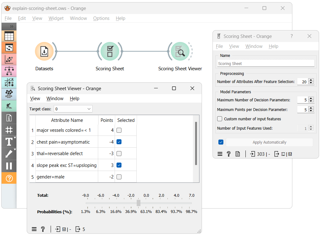
The workflow above shows the most straightforward way of using the Scoring Sheet widgets. Here, after training the Scoring Sheet model using our dataset, we input it into the Scoring Sheet Viewer widget, which presents us with a, you guessed it, scoring sheet. It shows each feature's contribution to the final score, where a higher score indicates a greater chance for an individual to be classified with the target class. Each feature's contribution can be positive or negative, indicating whether it increases or decreases the risk.

Before we continue with the example, let's try to understand how to use the Scoring Sheet widget and what each parameter does.
-
Number of Attributes After Feature Selection - The underlying model requires binary features; therefore, it discretizes continuous features and one-hot encodes categorical ones. This parameter helps to reduce the potentially large number of resulting features and ensures faster learning by selecting only the best features for model training.
-
Maximum Number of Decision Parameters - Model size: balancing complexity and explainability. More parameters (features) can increase accuracy but make explanation harder.
-
Maximum Points per Decision Parameter - The range of points each decision parameter (feature) can contribute. A wider range can increase model complexity and accuracy but may reduce explainability.
-
Number of Input Features Used - Specifies how many original features (before binarization) the decision parameters can originate from. This can ensure that each parameter originates from a unique feature or when only a subset of features is desired.
To keep this blog at a reasonable length, we can't go into too much detail on how the Scoring Sheet widget works. However, we should mention the backbone of the widget, a clever algorithm called FasterRisk. If you want to learn more about it, consult the paper.
Let's return to the example and focus on the Scoring Sheet Viewer widget.

I've modified the workflow by dividing the data, with a portion routed to the Table widget. This setup allows us to select instances and observe how the Scoring Sheet performs with new, unseen data.
The model for heart disease data features five decision parameters, with points ranging from -5 to 5. We have set the target class to '1,' indicating the 'presence' of heart disease. Thus, positive-value decision parameters increase the risk of heart disease, while those with negative values reduce it.
Consider the selected instance from the Data Table widget. It has a 'slope peak exc ST' attribute value of 'upsloping,' which reduces risk by 3 points. However, it also has the 'chest pain' attribute set to 'asymptomatic,' increasing the risk by 5 points. This results in a total score of 2, corresponding to a 71.6% probability of having heart disease.
And there you have it. Understanding and reading the scoring sheet is straightforward. I am sure you can't wait to try out the new Scoring Sheet widgets yourself. Still, before you do, I should tell you that there also exists an Explain add-on for Orange, which offers other visualizations that can help you better understand your models.
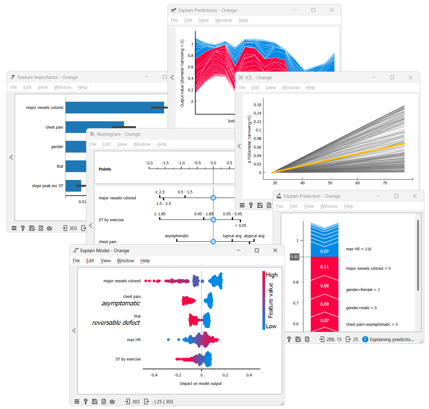
While the Scoring Sheet provides easily understandable explanations, its requirement for binarized attributes can limit its usability in some scenarios. Its visualization tool, the Scoring Sheet Viewer, is also exclusive to this model. A Nomogram offers more freedom because it is not limited to binarized features but is only compatible with Naive Bayes and some linear models. Feature importance highlights the most influential variables in your model, which is perfect for feature selection. SHAP offers instance-level explanations of the contributions of feature combinations. Lastly, ICE Plots show how value changes in a feature affect predictions, which is invaluable for “black-box” models. Unlike Scoring Sheet and Nomogram, Feature Importance, SHAP, and ICE Plots can be used with any model.
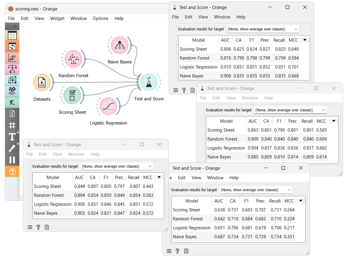
While the main focus of this blog was explainability, accuracy is also important. We've compared the ScoringSheet model with some other models on different datasets. From the results in the Test and Score widget, we can see that the Scoring Sheet model is not the most accurate but is also not far from it. However, the Scoring Sheet model is much more easily explainable than most other models.
If you want to try the Scoring Sheet widgets for yourself, you should download the Prototypes add-on and the workflow, which we used for the example.