Interactive Data Visualization
Orange is all about data visualizations that help to uncover hidden data patterns, provide intuition behind data analysis procedures or support communication between data scientists and domain experts. Visualization widgets include scatter plot, box plot and histogram, and model-specific visualizations like dendrogram, silhouette plot, and tree visualizations, just to mention a few. Many other visualizations are available in add-ons and include visualizations of networks, word clouds, geographical maps, and more.
We take care to make Orange visualizations interactive: you can select data points from a scatter plot, a node in the tree, a branch in the dendrogram. Any such interaction will instruct visualization to send out a data subset that corresponds to the selected part of visualization. Consider the combination of a scatter plot and classification tree below. Scatter plot shows all the data, but highlights the data subset that corresponds to the selected node in the classification tree.

Great Visualizations
Orange includes many standard visualizations. Scatter plot is great for visualizing correlations between pair of attributes, box plot for displaying basic statistics, heat map to provide an overview across entire data set, and projection plots like MDS for plotting the multinomial data in two dimensions.
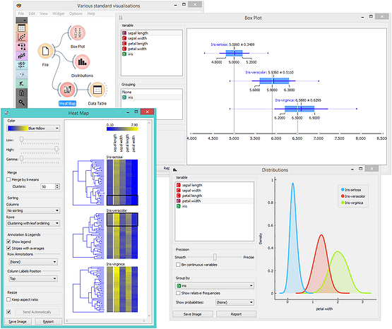
Besides visualizations one would expect in a data mining suite, Orange includes some great extras that you may not find in other packages. These include widgets for silhouette plot to analyze the results of clustering, mosaic and Sieve diagram to discover feature interactions, and Pythagorean tree visualization for classification trees and forests.

Exploratory Data Analysis
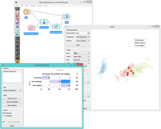
Interactive visualizations enable exploratory data analysis. One can select interesting data subsets directly from plots, graphs and data tables and mine them in them downstream widgets. For example, select a cluster from the dendrogram of hierarchical clustering and map it to a 2D data presentation in the MDS plot. Or check their values of in the data table. Or observe the spread of its feature values in a box plot. Open all these windows at once and see how the changes in your selection affect other widgets. Or, for another example, cross-validate logistic regression on a data set and map some of the misclassifications to the two-dimensional projection. It is easy to turn Orange into a tool where domain experts can explore their data even if they lack insights in underlying statistics or machine learning.
Intelligent Visualizations
Sometimes there are just too many choices. Say, when data has many features, which feature pair should we visualize in a scatter plot to provide most information? Intelligent visualization comes to the rescue! In Orange's scatter plot, this is called Score Plots. When class information is provided, Score Plots finds projections with best class separation. Consider brown-selected data set (comes with Orange) and its 79 features. There are 3,081 (79*78/2) different features pairs, way too many to check them manually, but there are only a few feature combinations that yield a great scatter plot. Score Plots finds them all, and allows us to browse through them.

Reporting
Finally, we can include the most important visualizations, statistics and information about the models into the report with a single click. Orange includes clever reporting where you can access workflow history for every widget and visualization directly from the report.
